Designer Bio

My name’s Veloria Pinch, though most people call me Vel. I am 22 years old, born and raised in Kingston, Ontario. I am a well-rounded student who has practiced digital and analog art forms from a young age.
When it comes to graphic design I excel at creating a functional and user-friendly app design however I have yet to develop the coding skills to implement them. I am experienced in a majority of the Adobe creative suite products as well as the Microsoft office suite. Using my creativity and knowledge of the subject matter I enjoy solving graphic design problems as an individual or alongside a team.
Email: Veloria@hotmail.ca
Linkedin: in/veloria-pinch
instagram: @velpinch.design
App Design
Objective
The purpose of this project was to identify a problem at our discretion and create a design solution for it. This project would span over a series of 5 weeks and have students create a prototype that solved the problem they identified by compiling all the information they gathered during their short research phase.
Description
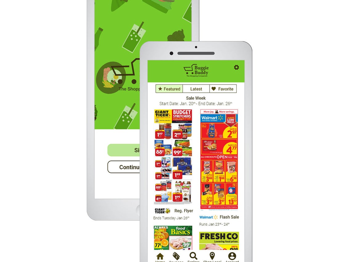
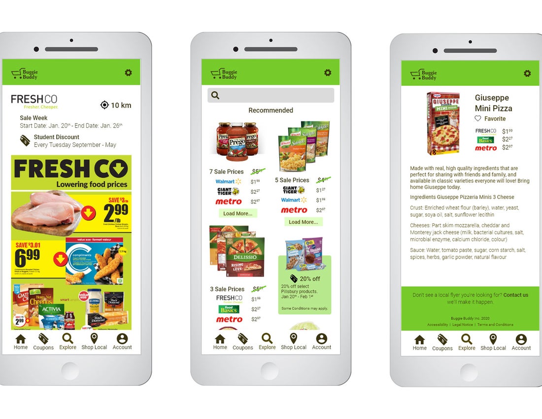
For this independent project, I focused on prototyping a compare and save grocery app that would help both individuals and families save money while getting all the groceries they need.
Though food is a necessity, not every individual has the time to look through every flyer and run to every grocery store in search of the sale items they need. The other factors to consider are which grocery stores price match or have a demographic discount that caters to you - where is it most beneficial to do my grocery shopping. This app prototype I built would allow you to not only search for items but discounts and stores that price match so you can make a detailed route, making the most of the users time.
Rebranding and Adaptations
Objective
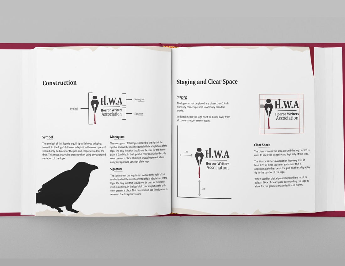
The purpose of this project was to take the accumulated branding work we had created throughout the semester and create a cohesive and understandable brand guide using appropriate and professional language. This project was to be carried out over 4-weeks and teach the student how to create a brand guide that could be understood by anyone who would need to use it, not limited to designers.
Description
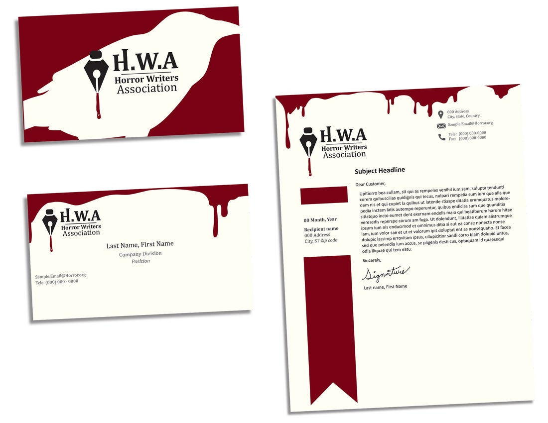
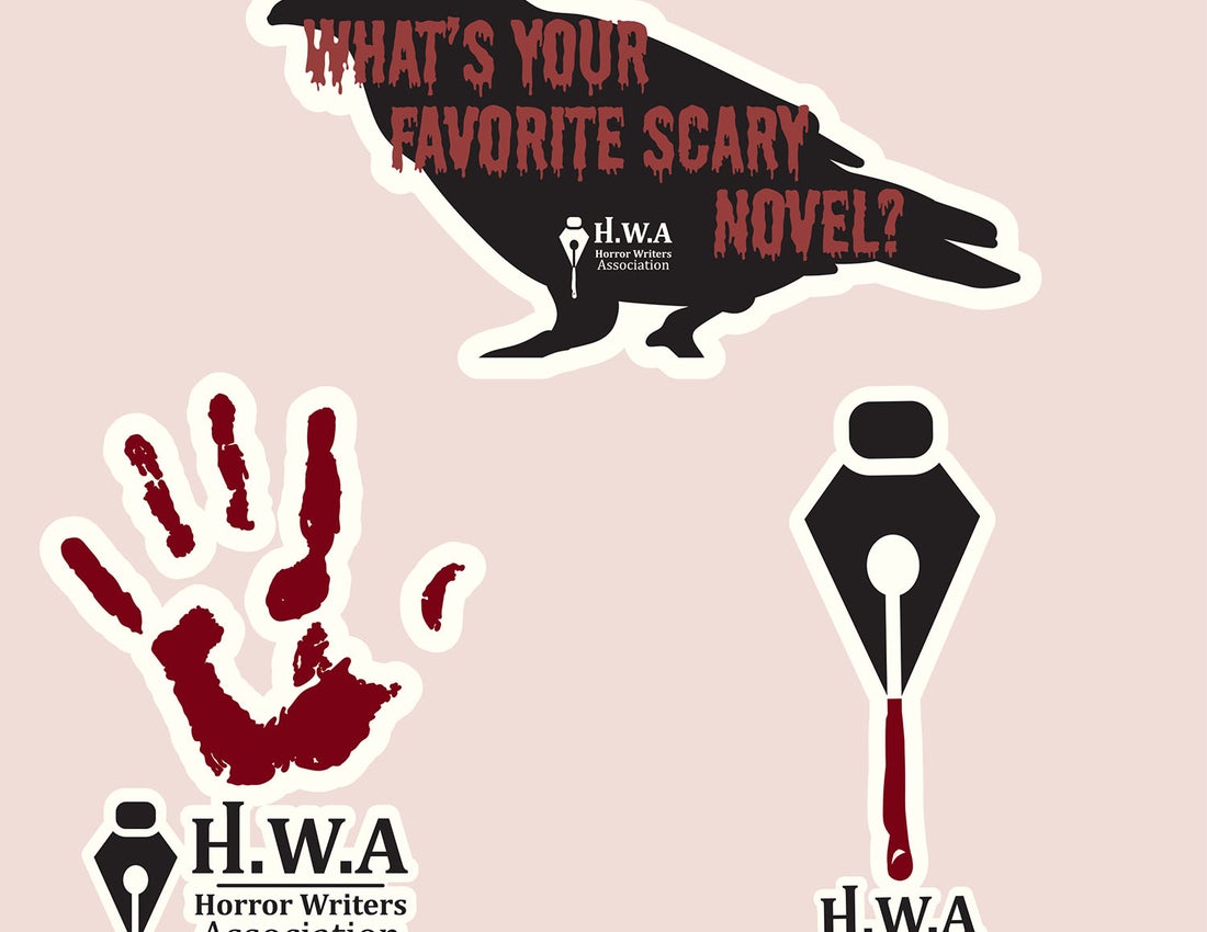
For this semester I was focused on creating a new brand identity for the horror writers association. This an organizes that I researched without a strong visual identity although it has an extensive network and history.
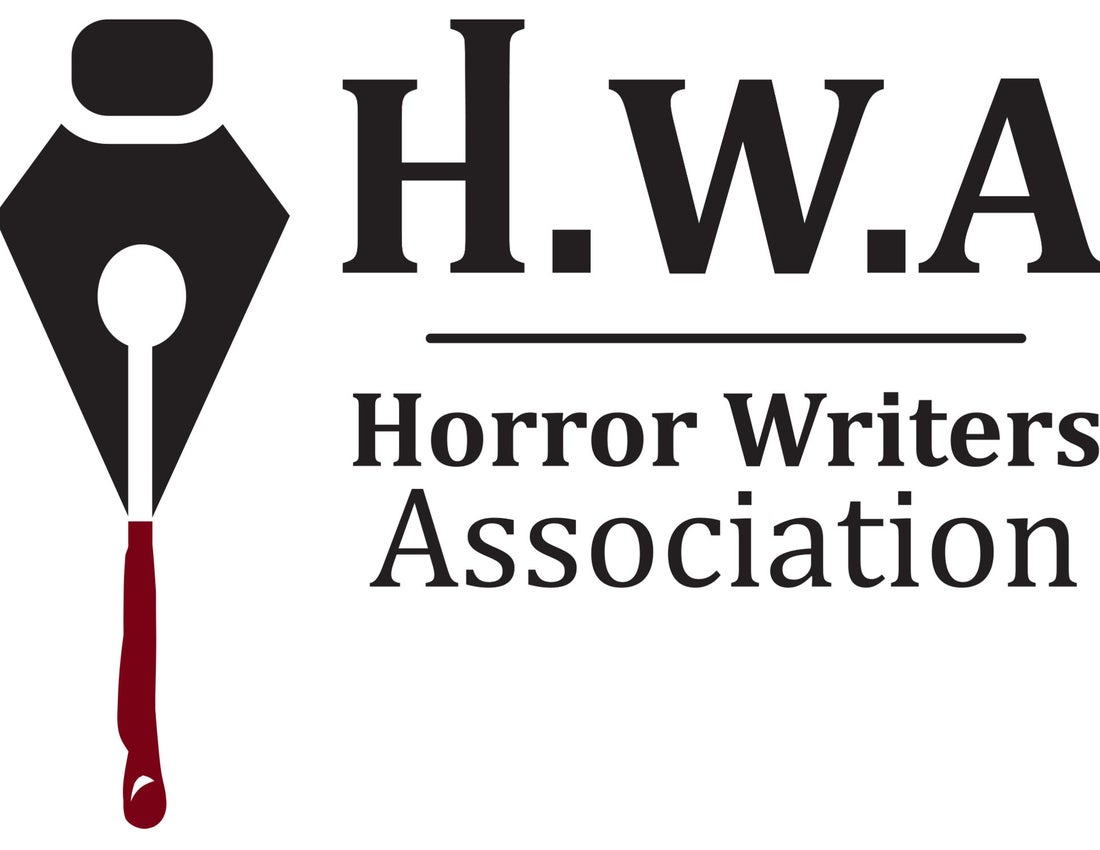
The logo variation I settled on for this project was a pen quill with an ink drip paired with the written signature “Horror Writers Association”. Though the logo is simple there is a series of hidden symbols though out the logo which are associated with the horror genre or the association’s values. The guide itself is stylized like an old and worn novel with a distressed page border and a fabric bookmark design to display the page numbers.
Capstone Project
Objective
The purpose of this project was to identify a problem at our discretion and create a design solution for it. This project would span over an entire semester and has students create a prototype that solved the problem they identified through research, testing and multiple revision. This project is the accumulated knowledge of the St. Lawrence graphic design course put into practice.
Description
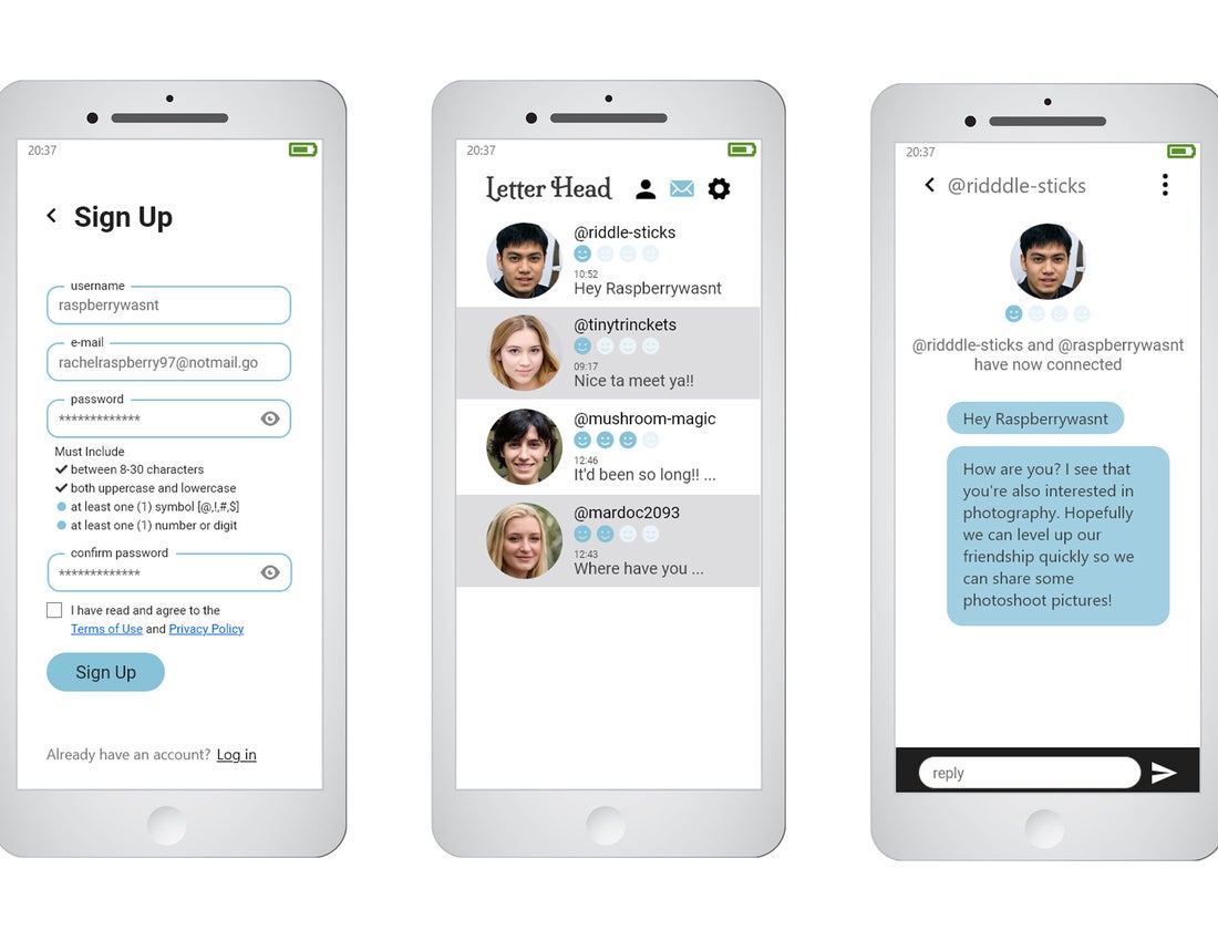
The problem I chose to research and undertake for this semester-long project was an exploration of social interactions/communications in regards to the current Covid-19 restrictions to design a tool that would allow for English-speakers ages 18-30 to continue to have safe, interesting, and/or genuine interactions with new people during the pandemic.
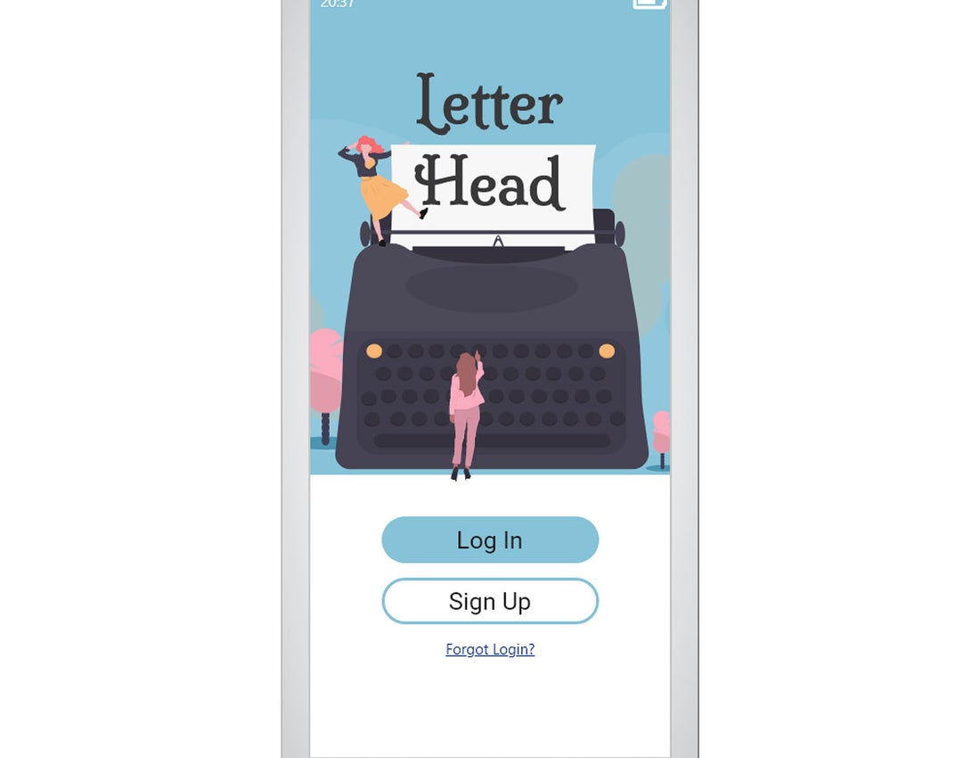
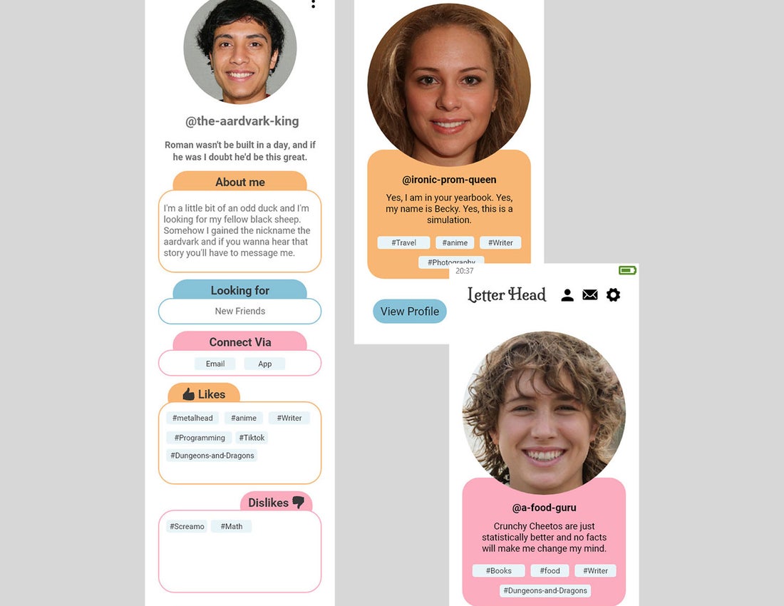
For my prototype, I chose to do a pen pal app design which would - if created and marketed - have 3 ways of communication depending on the users’ preference and the time they wish to dedicate to a pen pal like program. The app matches people based on interest tags and avoids matching those whose interest tags fall into the users dislike tags.
