Designer Bio

I’m a creative problem solver who is always looking for new tools and techniques to better realize my visions. I started with a passion for illustration and tech, creating websites, games and animations, but I had no formal experience. The desire to learn about visual communication and graphic design beyond what my hobbies had taught is what drew me to enroll in the St. Lawrence graphic design program. Through the program, I gained insight into how to approach design problems, learned how to use typography effectively, and developed even more of an appetite to create.
I am attentive to detail and constantly analyze techniques and styles to help develop my own. I like to create design systems and think of ways to make them extendable and adaptable as I feel that is integral to strong branding.
Digital mediums are my strong suit, with animation and interactivity being practiced skills of mine, but I also have applied my skills to many print projects, ranging from flags to books.
Web: andrewwalmsley.com
Email: design@andrewwalmsley.com
Children's Education App
Objective
The objective of this project was to design an app to promote mathematics and language learning for Kindergartners around the age of five, reinforcing expected learning outcomes according to the Ontario curriculum.
Description
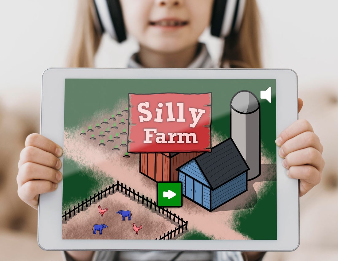
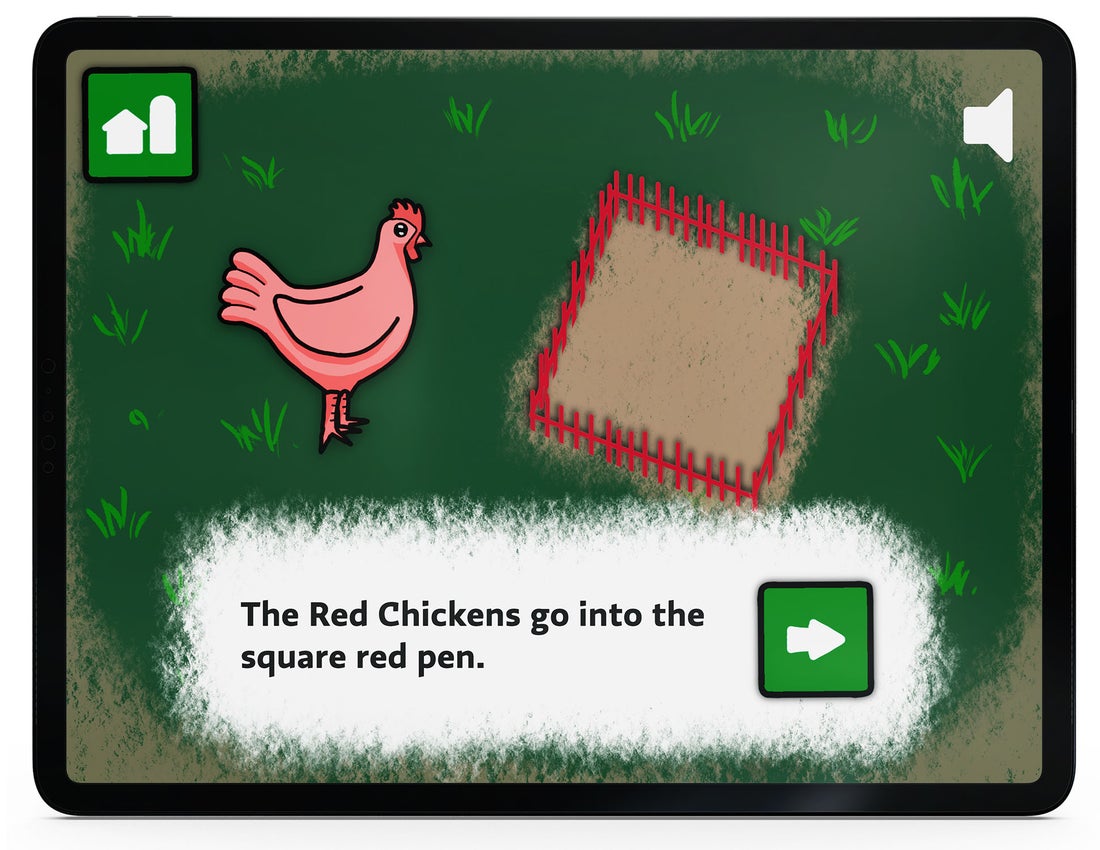
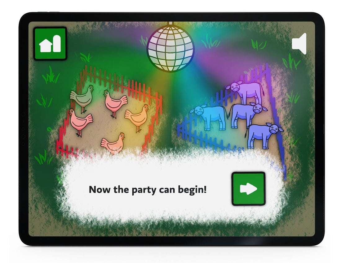
I design the children’s education app “Silly Farm” to teach colour and shape matching skills, focusing on helping rainbow-coloured animals back to their pens. Once I had defined the interactions, I created a robust and consistent illustrative style that used simple shapes and cute animals to keep things clear and interesting to Kindergartners.
Grad Show Exhibition Show
Objective
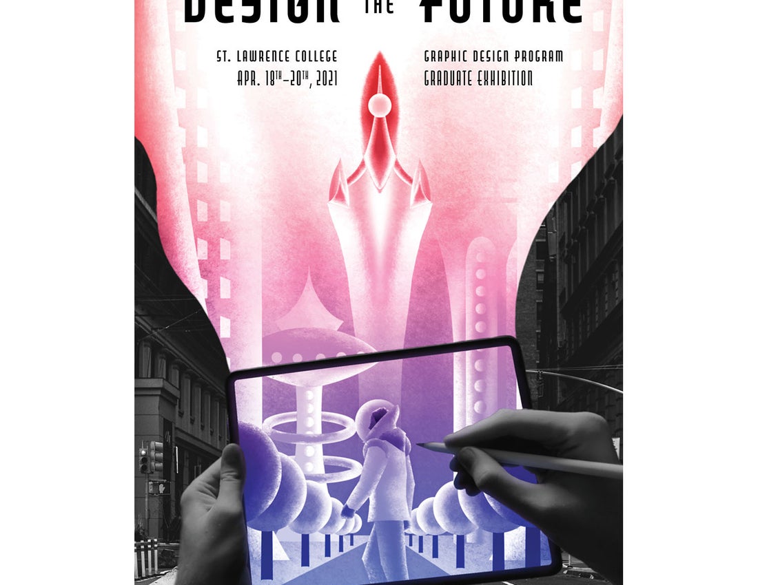
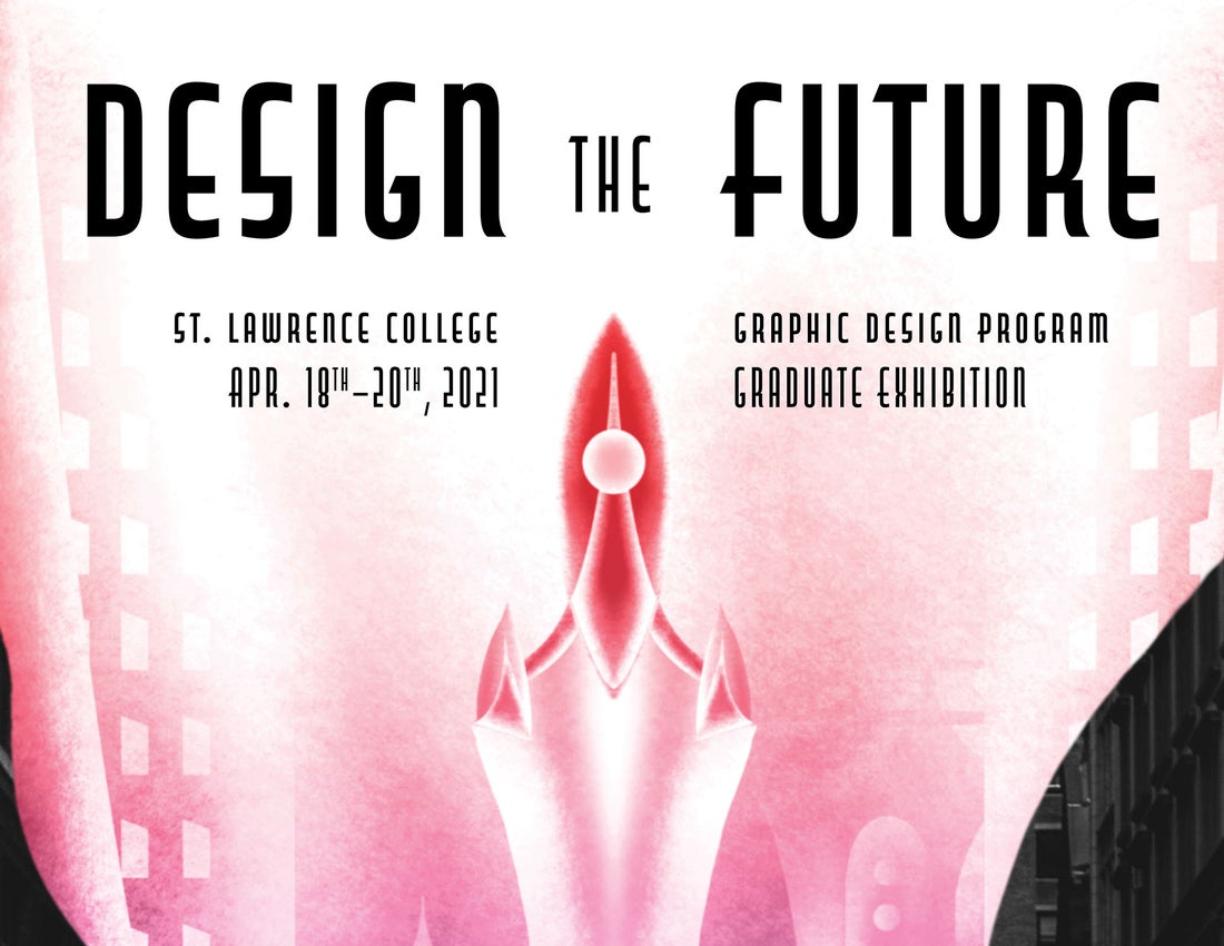
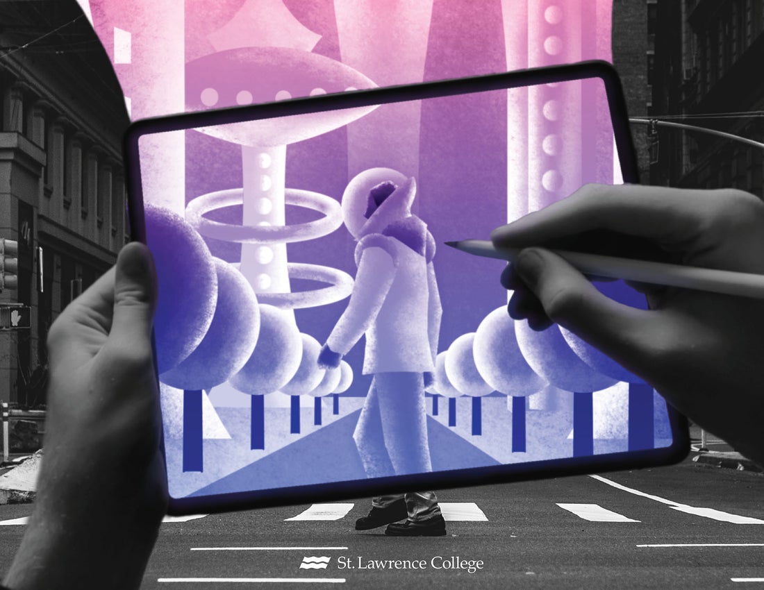
The objective here was to create a poster that represents St. Lawrence’s Graphic Design Program and advertises the graduate exhibition.
Description
I wanted to depict an optimistic outlook on graphic design and the future, so that was where I started with planning this poster. I thought of things that were both visually futuristic and could be graphically dynamic. I realized that retro-futurism was the perfect match for my idea. This portrays to the audience that the program is forward-looking and gives a inspiring impression of the goals of the program. I took this idea and extended it to where a designer is depicted with their “ideas” flowing out of their tablet. To round out the look I used a thematic font that gives the feeling of glimpsing the future.
Logo and Menu Creation
Objective
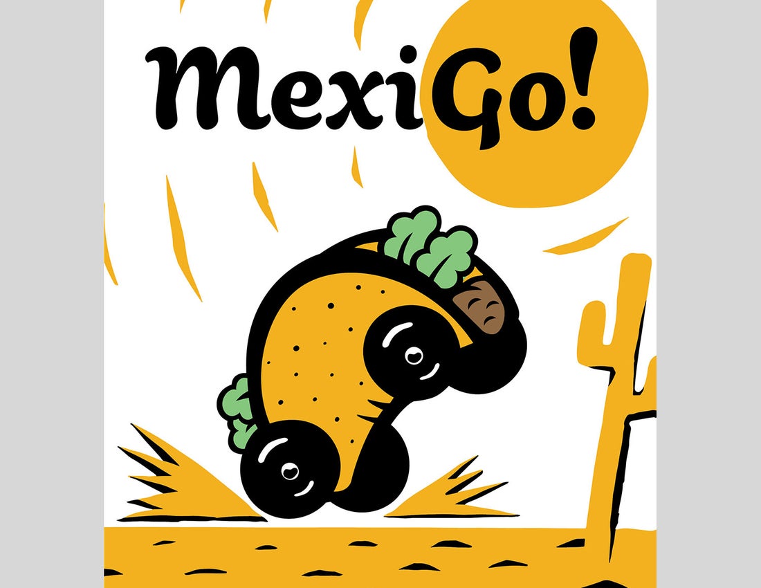
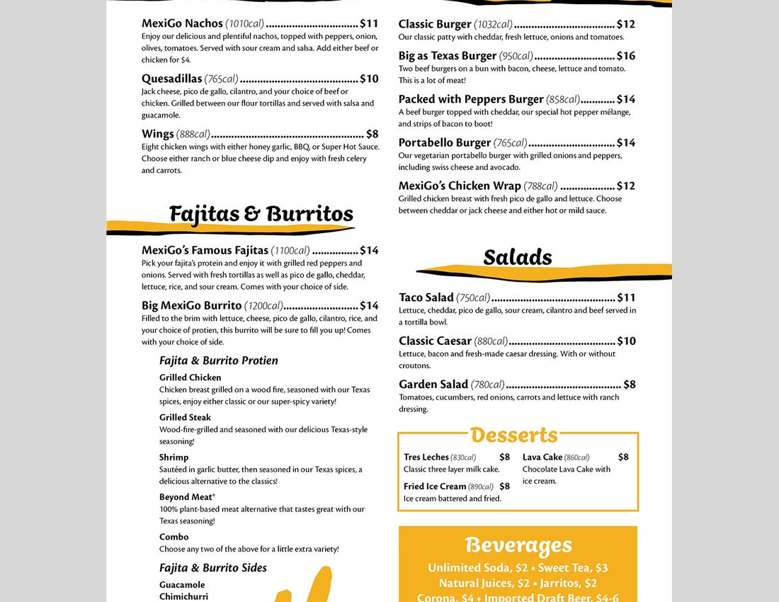
The goal of this project was to design a logo, brand identity and menu that represented MexiGo and its main values. The key idea the branding had to convey was that MexiGo is family-friendly, fresh and fast.
Description
To best represent the ideals of the brand, I devised a fun and friendly logo that combined both an iconic Tex-Mex meal, as well as a sense of speed. The taco-car symbol was designed to evoke a sense of movement with its reared pose, and with its references to old cartoons in style, it sells the idea that the restaurant moves quickly. I chose an accompanying font that shared a similar illustrative nature and was equally playful to round out the logo.
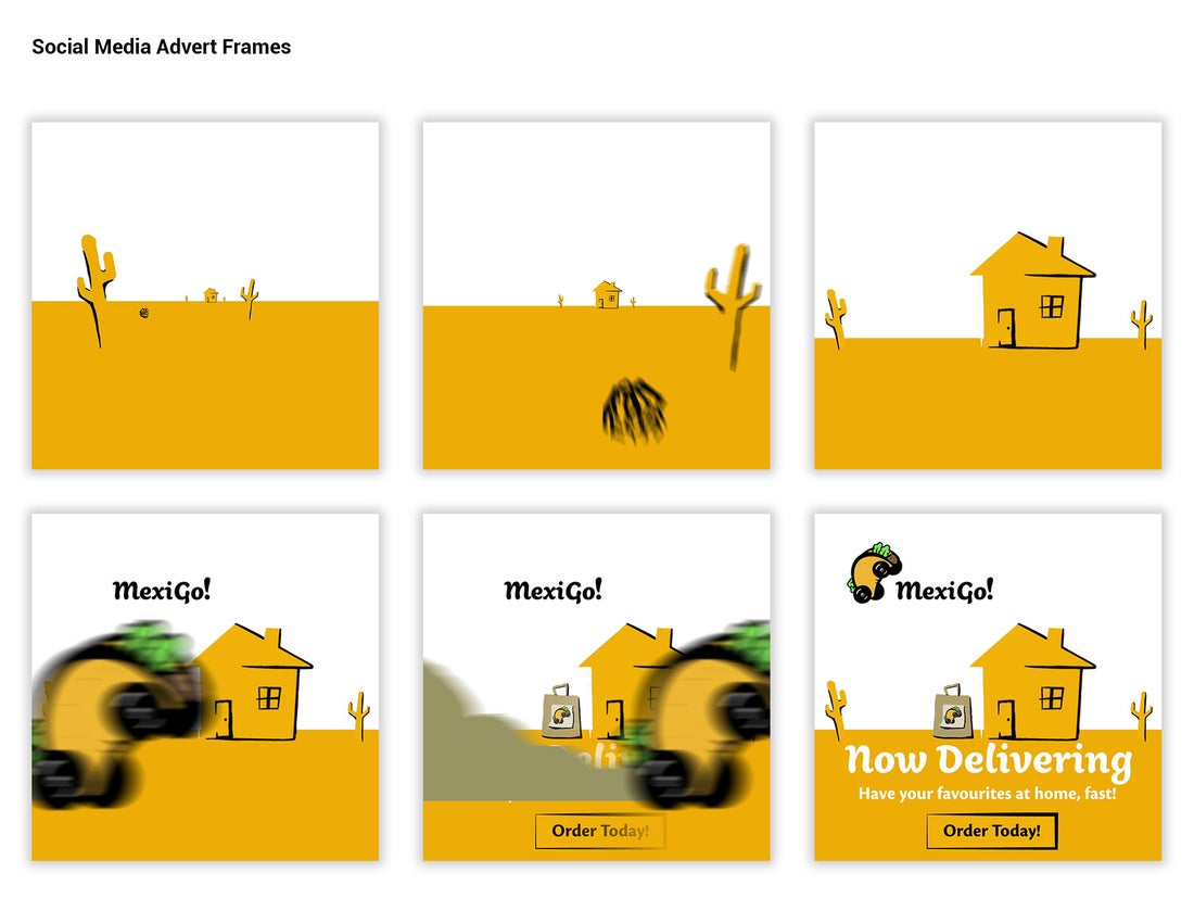
I took the illustrative style I developed for the logo and extended it into the menu design, using the energetic golden-yellow from the Taco-car to draw attention to key points. I also created an animated advertisement for delivery, as It is an important market to capture especially during the pandemic.
